

Lufthansa is Europe's second-largest airline, with a website that is chaotic. I redesigned the website to create a simpler and more pleasant experience.

Client
❋ Concept work
Timeline
❋ 2 weeks
Role
❋ Product designer
Tasks
❋ UX design
❋ UI design
❋ User research

Overview
Lufthansa is the second biggest airline carrier in Europe. They currently have numerous subsidiaries that cover all sorts of air travel, from freight to commercial services.
Although they are so large their website is still very difficult to navigate, with poor hirachy, misalignment, and poor UX navigating you away from flows.
The brief for this project was to redesign a simpler and easier Lufthansa’s flow for booking flights, with updates to the UX and UI.
Booking travel can be overwhelming and we want to give users a positive and relaxing experience.
The problem
Website analysis
Although having a very strong home page, as you move through the Lufthansa flow to purchase a ticket we start to see a breakdown in the UI and the UX.


As soon as we navigate away from the homepage the slickness of the UI is lost, but there is important information easily acessable on the booking page.
On this page we can also see a breakdown in hirachy making the information on the page feel cramped and difficult for the user to discern what is important.
As the flow continues we see large walls of text making it quite overwhelming for the user to find the important information.
But the flow from the carbon offset creates the biggest issue as it diverts you to another window.


This new window that opens for the carbon offset, uses a different UI and a complex function for the user to calculate their offset.
The new window and UI doesn’t instill a lot of confidence in the user to add the cost to their flights and offset their carbon emissions.
Competitor analysis
Delta
For the redesign, I researched how two other major airlines Delta and Qantas have solved this problem through their design patterns and language.
Delta has a simple and clear UI and a very easy UX. Making it quick for users to find the information they need, and make their purchase.


Their booking page really stood out, making it easy for users to adjust currency and language — an important feature when creating a product for people around the world.
The booking page also only required one click to select the flight, making the process as efficient as possible for the user.
Qantas
Qantas also had a simple UI, the sections were all really well spaced, making it easy for users to navigate through all the information.


Although Qantas has a simple UI, the booking page is not quite as clear as Delta.
Falling into the same trap as Lufthansa by creating having some important information quite small and hard to find.
The Qantas passenger details and payment page moves away from the difficult UI on the booking page.
With great spacing and hierarchy for users this page makes it easy to see what is included in the flight and make informed decisions on any additions required.

User research
Survey
A survey was developed to better understand the experience of booking flights across the world.
Users had a lot of issues with dark UX and chaotic UI, but also appreciated the convenience of booking and checking in online.

User personas
Using the user surveys, I built two personas. These focused more on their motivations and concerns when using the product rather than their occupation, age or gender.

Wireframes
Desktop wireframes
Using new and existing design patterns developed from the competitor research, I developed wireframes for five pages of a booking flow across desktop, tablet and mobile.
These wireframes incorporated the existing content and functionality on the Lufthansa website but simplified the UX — helping point them in the right direction.

Tablet wireframes


Mobile wireframes

Style
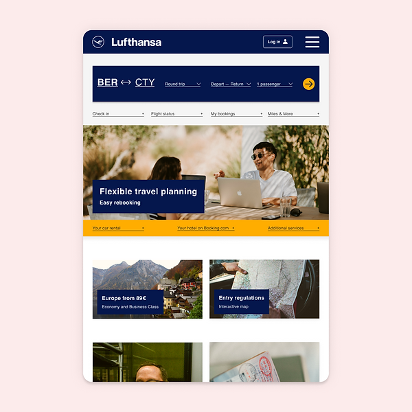
The style for the redesign of the website, built on the existing recognisable style of Lufthansa.
With such an established brand, I wanted to update the feel, without taking away from it being so recognisable.
The result was a much warmer feel to the design and more simple, bold design patterns.


Mid-fidelity design
Desktop
mid-fidelity
Using the existing content on the Lufthansa website and using the existing UI as a base, I developed a new style guide to create a more exciting and usable website.

Tablet wireframes
Mobile mid-fidelity

Testing & updates
User testing
I spoke to three semi-frequent travellers aged 25 – 35 to test the mid-fidelity prototype for the new Lufthansa website and booking flow.
Users were asked to book a flight from Berlin to Sydney return and asked to talk through their thinking process as they navigate through the flow.
The objectives of the tests were:
-
Test the user's ease to book a flight from Berlin to Sydney return
-
Test to see if there is enough information for the user to book the flight without any confusion
-
Observe any pain points or lack of clarity for the user
The feedback was very positive. Users enjoyed playing around on the prototype and had an easy time navigating through the flow, although wanted a little more information on the completion page.
Tablet mid-fidelity

Priority updates
Based on the user testing I piroritised the most impactful updates.
-
Add email field
-
Bold baggage that is included
-
Add "download tickets" on the completion page
-
Add info on check-in and boarding pass on the completion page
-
Add "share trip with friends and family" on the completion page
-
Edit one of the Entry Regulations headlines
-
Information button for Miles & More instead of "Join Now"

Learnings

Updating such an established airline showed me that there is always room for improvement when it comes to UX and UI.
The scope was larger than I had initially anticipated which helped me understand my timings and how to organise my schedule much better.
This project also helped me break from my own style and update the styles of an existing brand.
All in all, I am incredibly proud of the product that was created, which was both functional and very true to the Lufthansa style.